Projects
n1u
A fragmented fintech app built by three external vendors, with no shared vision and no identity to speak of. We rebuilt it from the inside — brand, UX, and product — launching a redesigned experience that finally spoke to young gamers.
Product Design
Brand Identity
UX Research
Design Systems
Mobile
Rebuilding n1u: A Digital Wallet for Gamers
As UX Design Head, I led the redesign of n1u from the ground up — brand, UX, and product — turning a fragmented app into a cohesive experience built specifically for young gamers.
The challenge:
Young gamers lacked financial solutions tailored to their lifestyle. Traditional banking apps didn't address the specific needs of gaming transactions, and they had limited access to tools for financial independence. Payment experiences across gaming platforms were fragmented, with no centralized management, and the community was looking for exclusive benefits tied to their financial activity.
Approach & process:
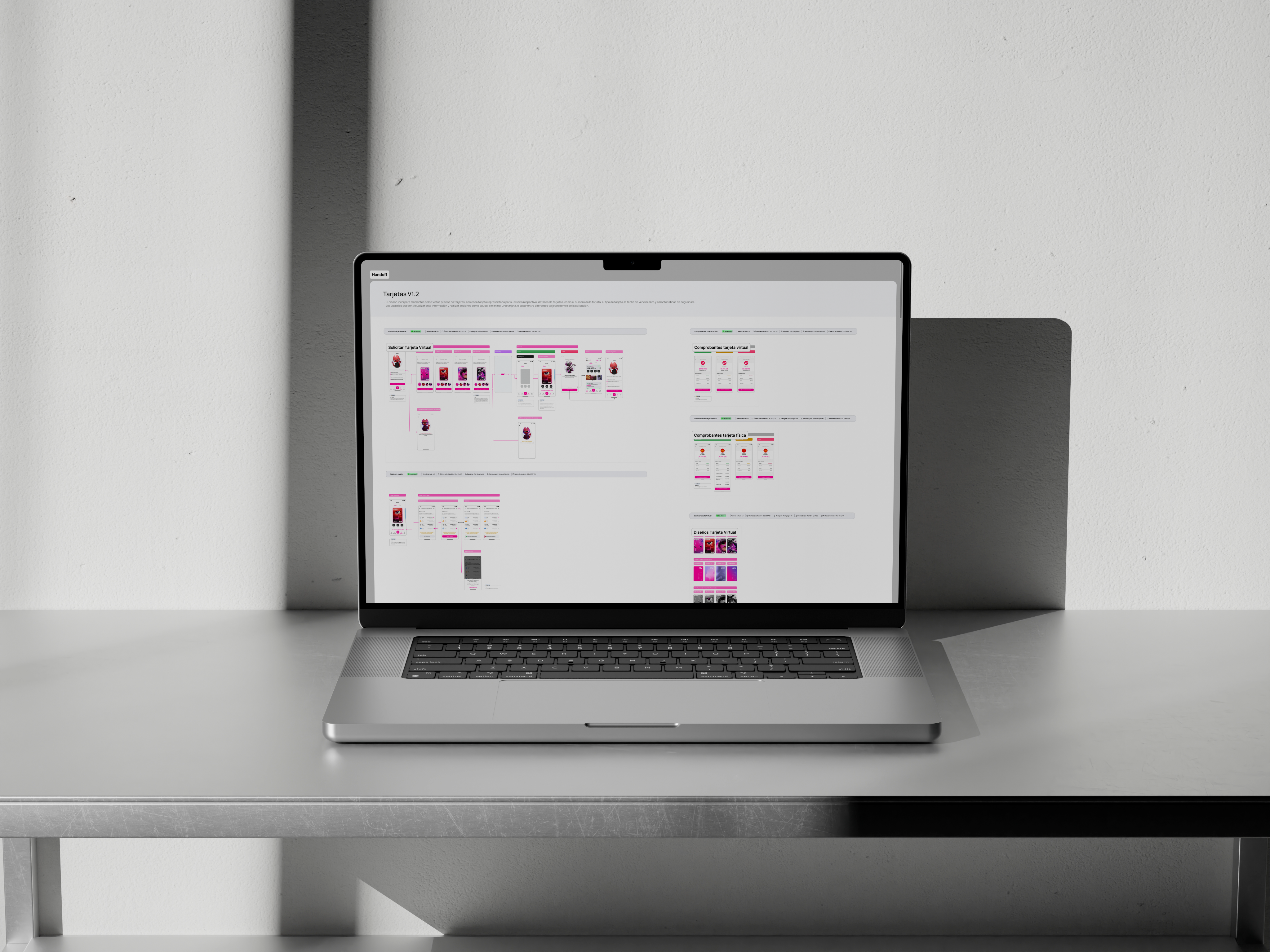
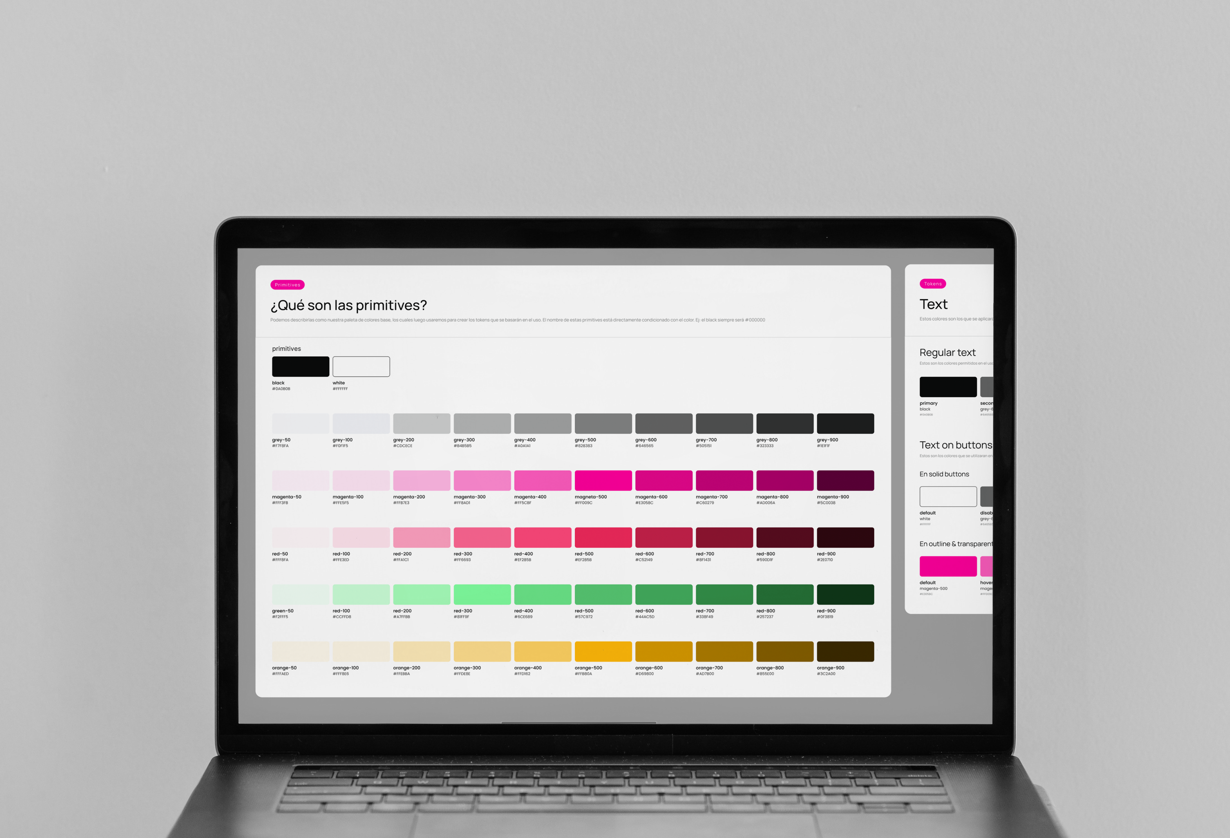
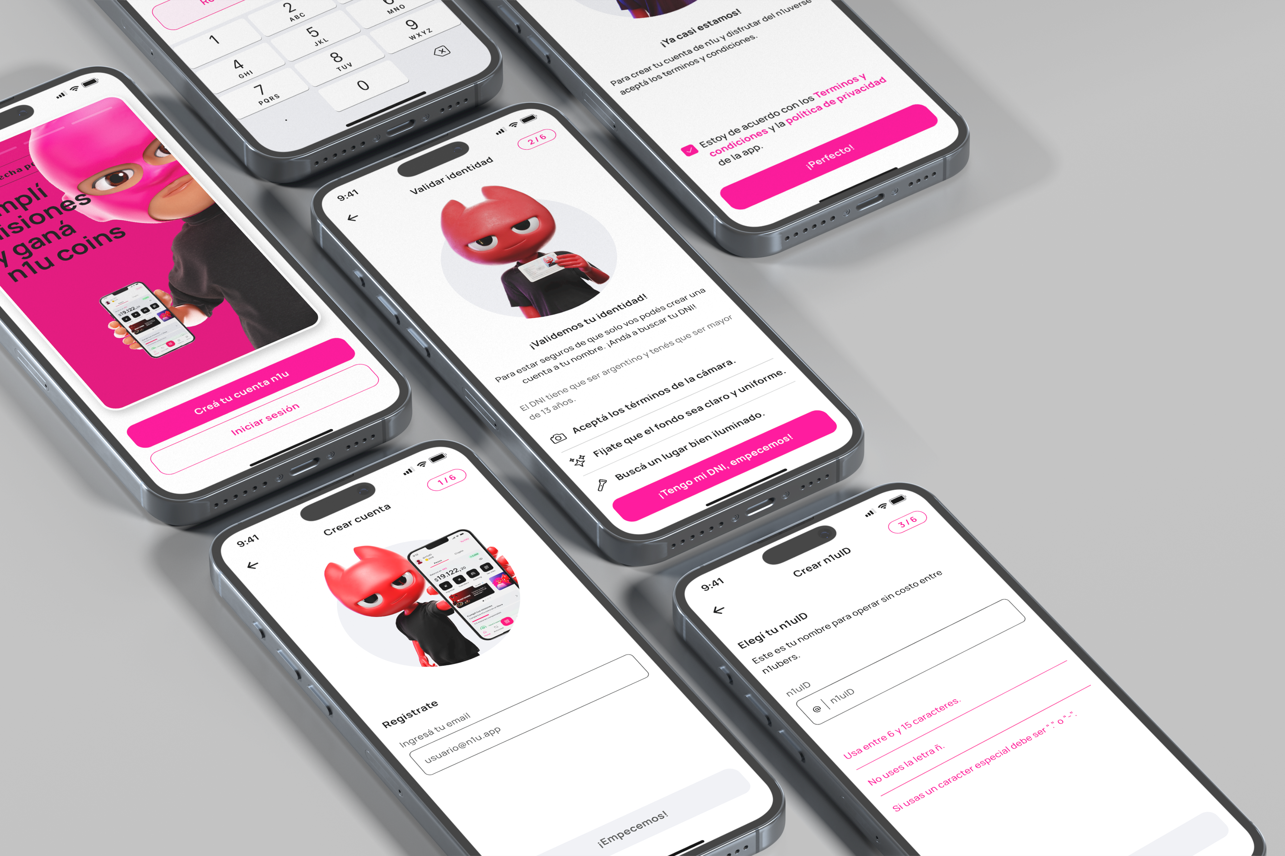
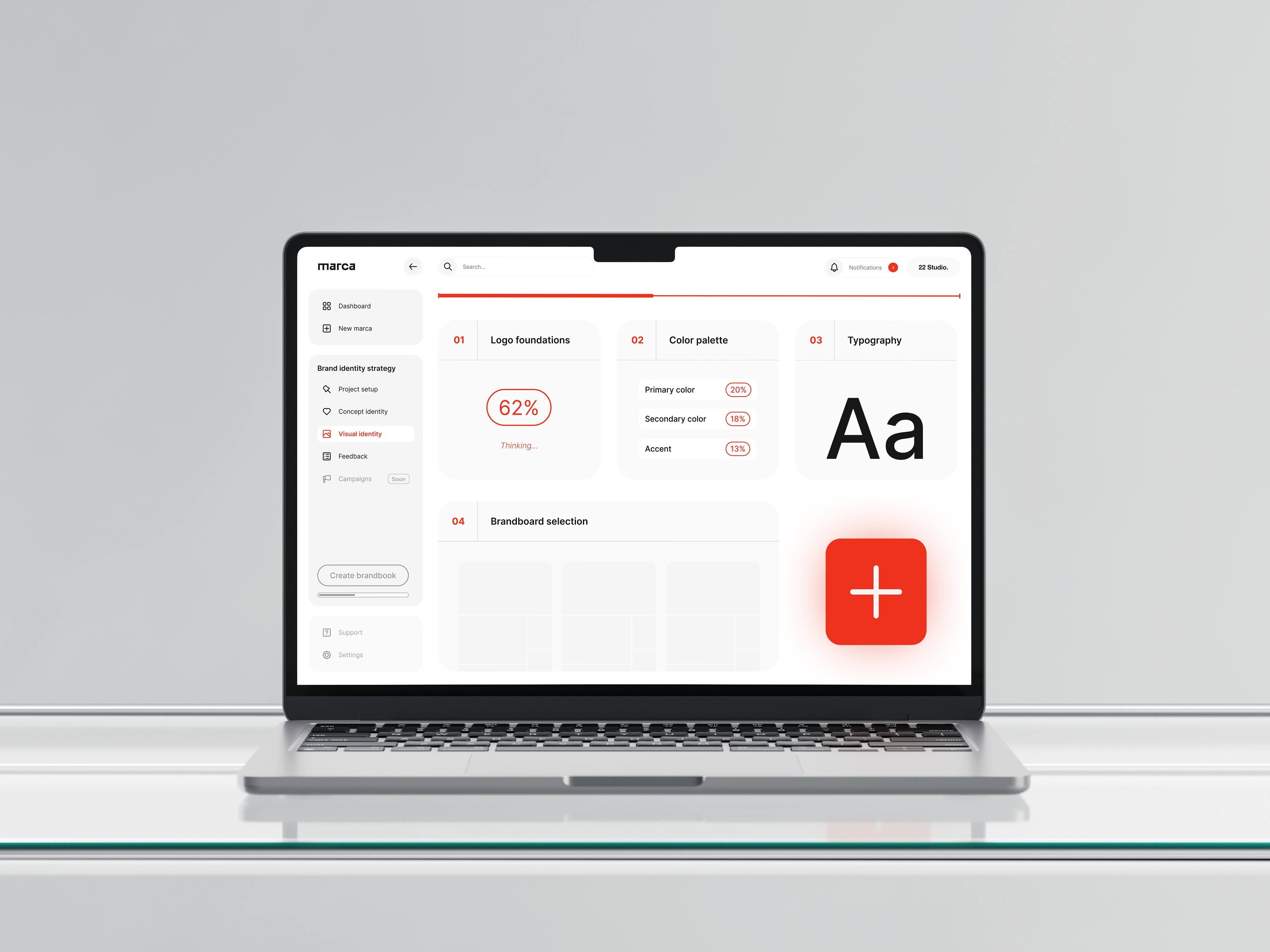
We started with comprehensive user research to define the primary persona and two secondary personas, mapping their distinct needs, motivations, and pain points. From there, we ran a full UX audit across every flow, identified friction points, and restructured the information architecture. The work moved through iterative discovery, validation, and implementation phases throughout development. In parallel, we built a new design system — visual language, typography, color palettes, and components — along with a component library and consistent UI patterns designed for scalability. Throughout, we collaborated closely with development to ensure every design decision was technically feasible.
Solution:
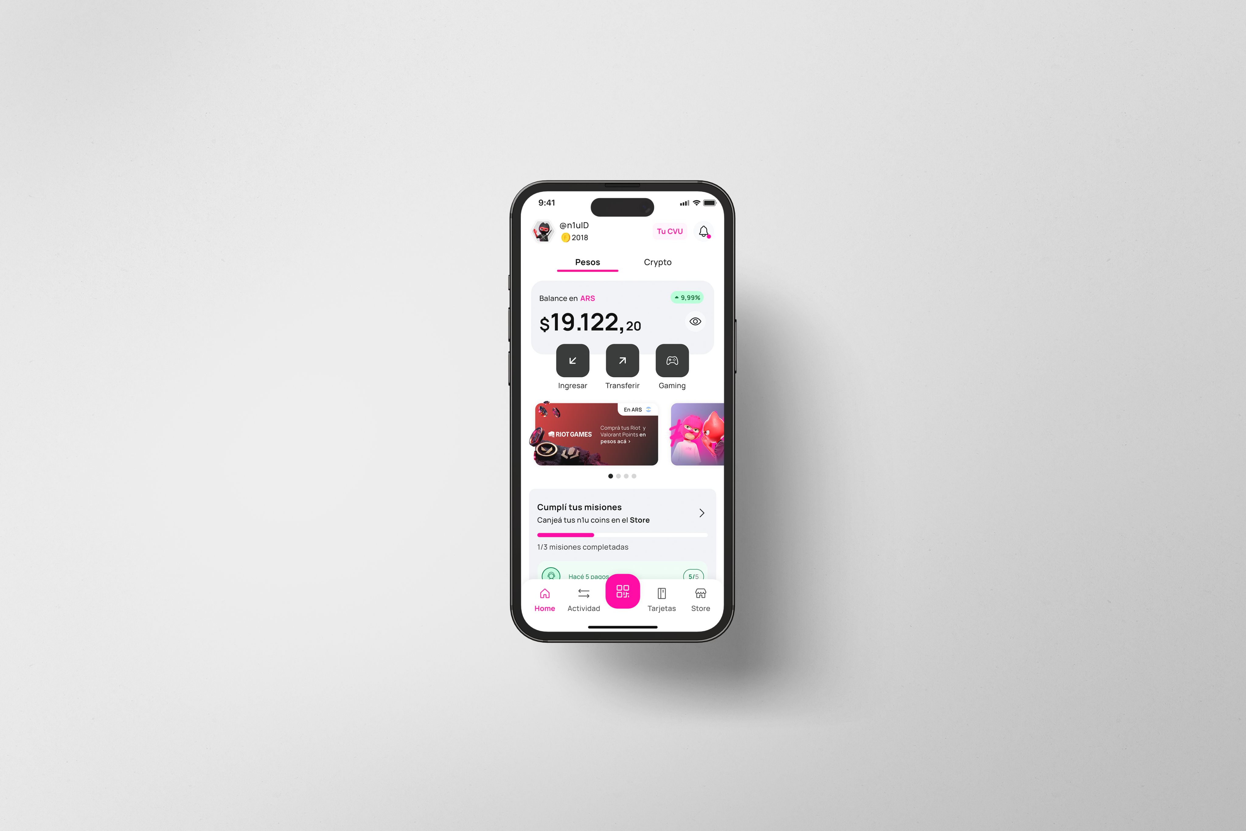
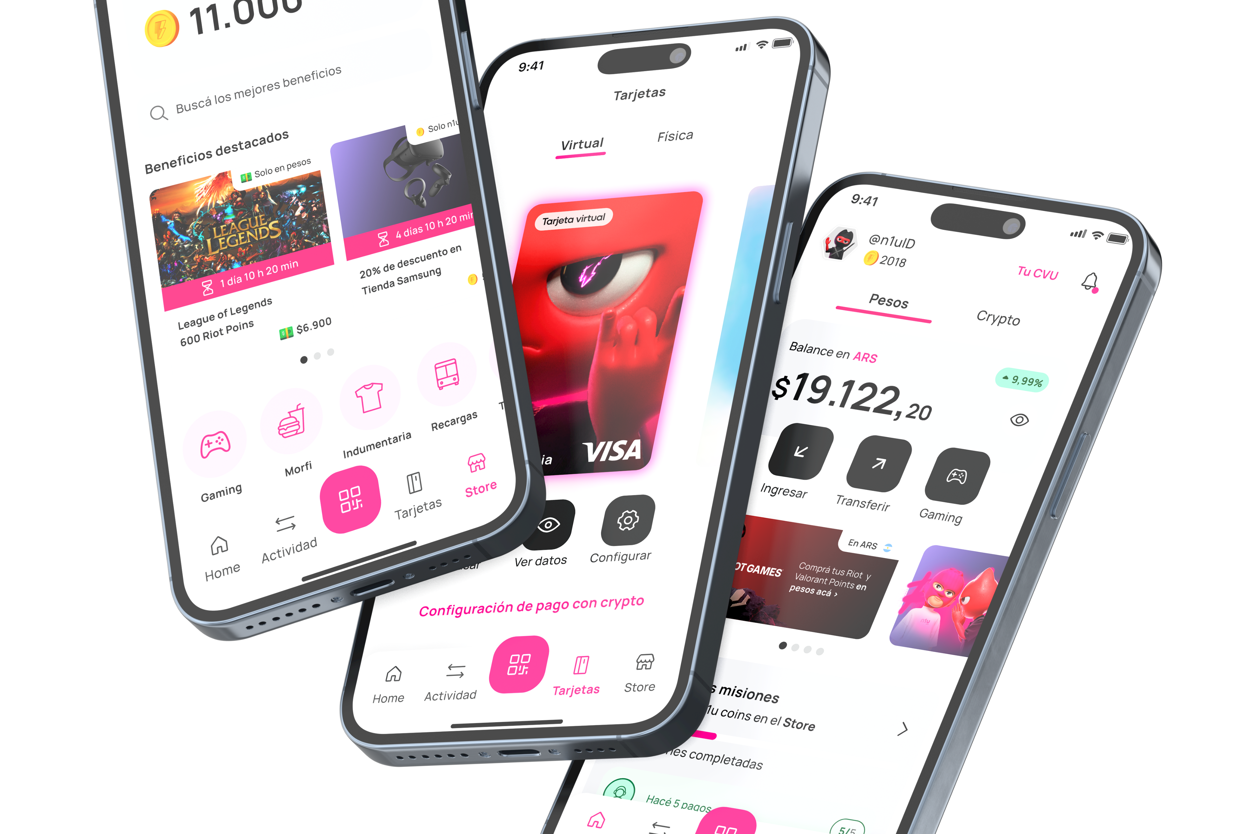
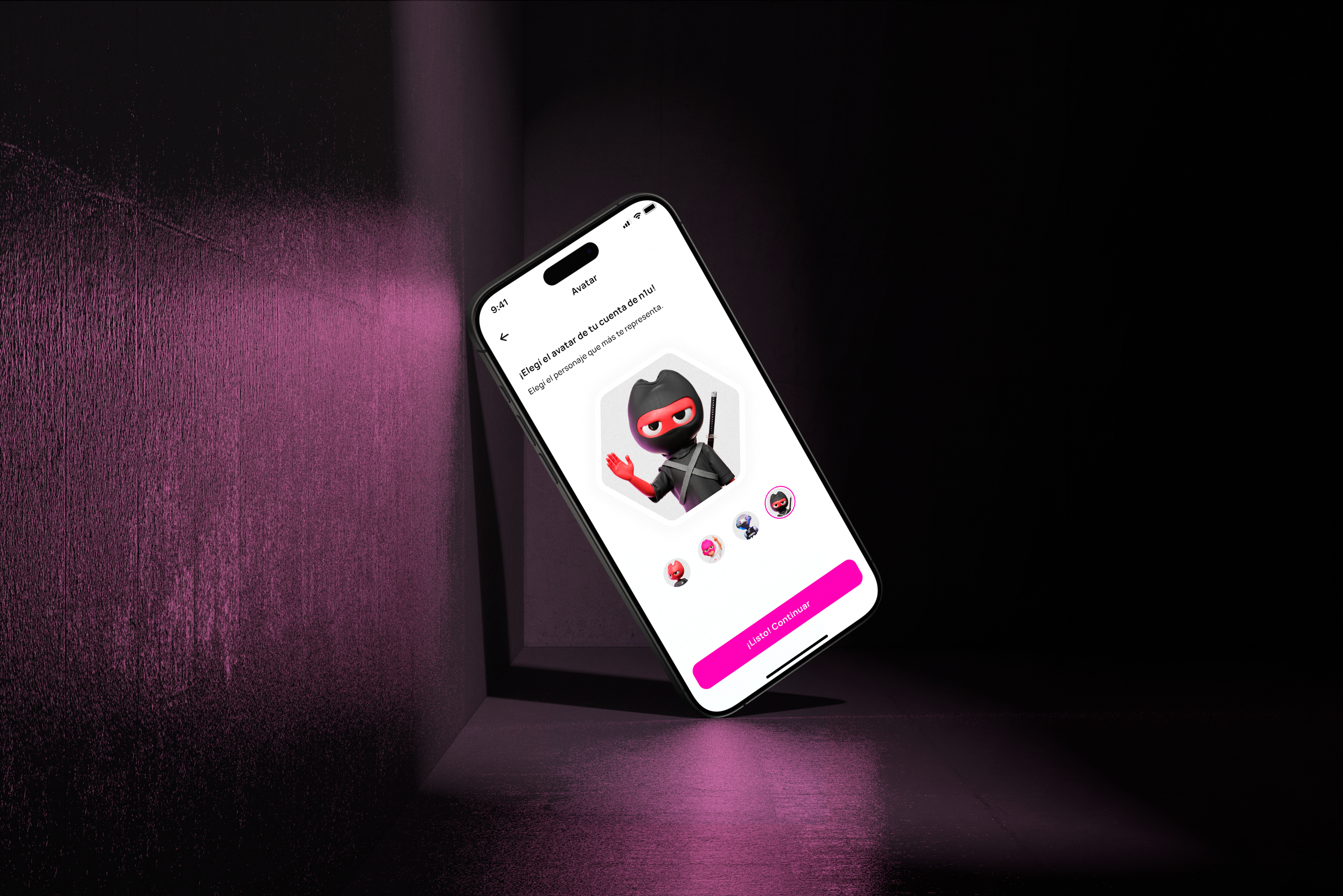
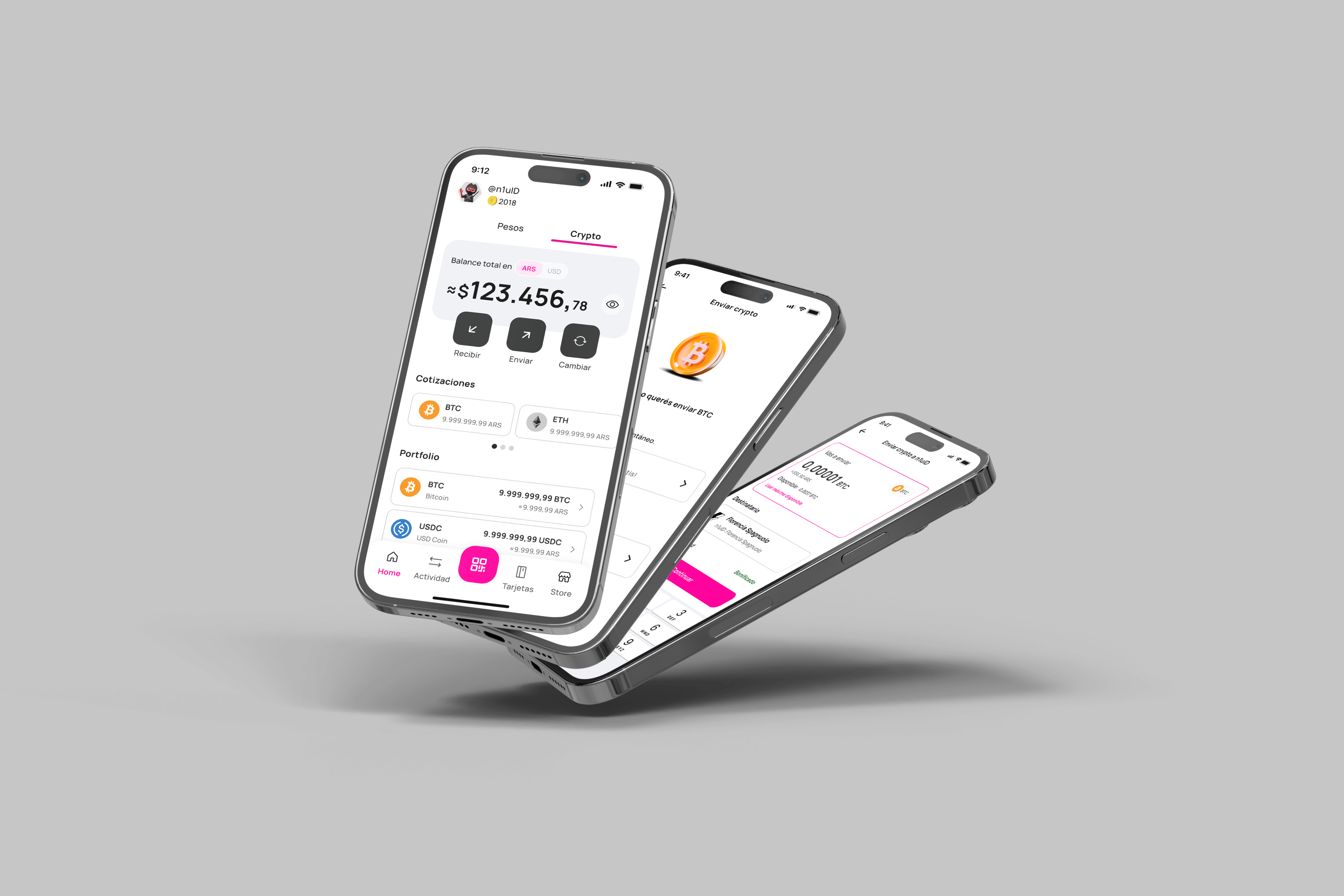
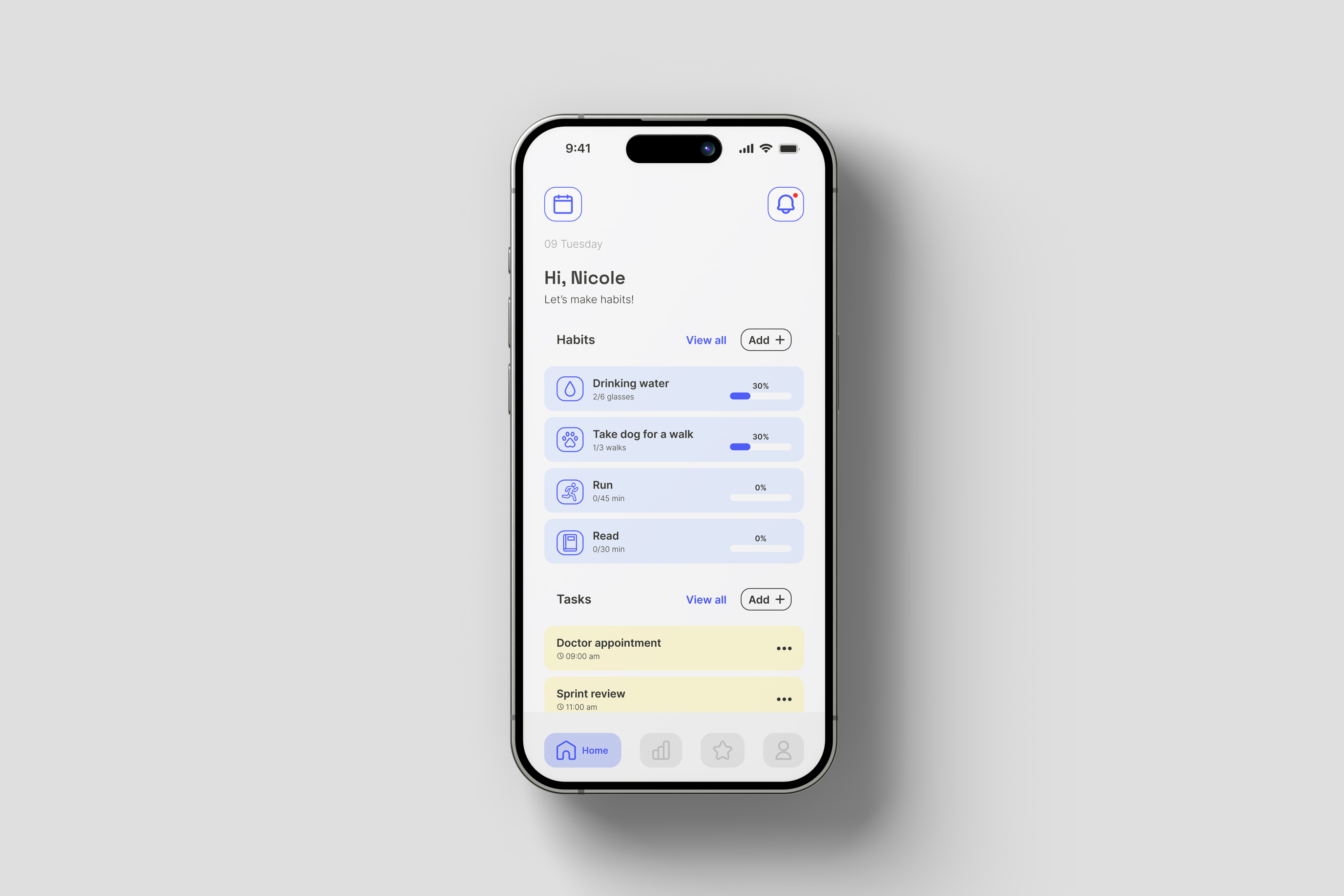
We designed an intuitive digital wallet with streamlined onboarding and authentication processes, and user-friendly interfaces for core financial functions — payments, transfers, and account management. We introduced gaming-specific features including in-game purchase capabilities and reward systems, and designed a mission-based engagement system to promote financial literacy and app usage. Customizable user profiles with avatar selection fostered community engagement, all tied together under a consistent, vibrant visual identity with magenta as the primary brand color.
Impact:
Successfully launched a financial product targeting an underserved demographic in the financial sector — shipped in 6 months. Onboarding completion improved from a 12.5% baseline, the redesign established a strong brand identity within the gaming community, and built a solid foundation for ongoing feature development based on user feedback and engagement metrics.

Other Projects


CONTACT
hi.florenciaspagnuolo@gmail.com
SOCIAL


Projects
n1u
A fragmented fintech app built by three external vendors, with no shared vision and no identity to speak of. We rebuilt it from the inside — brand, UX, and product — launching a redesigned experience that finally spoke to young gamers.
Product Design
Brand Identity
UX Research
Design Systems
Mobile
Rebuilding n1u: A Digital Wallet for Gamers
As UX Design Head, I led the redesign of n1u from the ground up — brand, UX, and product — turning a fragmented app into a cohesive experience built specifically for young gamers.
The challenge:
Young gamers lacked financial solutions tailored to their lifestyle. Traditional banking apps didn't address the specific needs of gaming transactions, and they had limited access to tools for financial independence. Payment experiences across gaming platforms were fragmented, with no centralized management, and the community was looking for exclusive benefits tied to their financial activity.
Approach & process:
We started with comprehensive user research to define the primary persona and two secondary personas, mapping their distinct needs, motivations, and pain points. From there, we ran a full UX audit across every flow, identified friction points, and restructured the information architecture. The work moved through iterative discovery, validation, and implementation phases throughout development. In parallel, we built a new design system — visual language, typography, color palettes, and components — along with a component library and consistent UI patterns designed for scalability. Throughout, we collaborated closely with development to ensure every design decision was technically feasible.
Solution:
We designed an intuitive digital wallet with streamlined onboarding and authentication processes, and user-friendly interfaces for core financial functions — payments, transfers, and account management. We introduced gaming-specific features including in-game purchase capabilities and reward systems, and designed a mission-based engagement system to promote financial literacy and app usage. Customizable user profiles with avatar selection fostered community engagement, all tied together under a consistent, vibrant visual identity with magenta as the primary brand color.
Impact:
Successfully launched a financial product targeting an underserved demographic in the financial sector — shipped in 6 months. Onboarding completion improved from a 12.5% baseline, the redesign established a strong brand identity within the gaming community, and built a solid foundation for ongoing feature development based on user feedback and engagement metrics.

Other Projects

CONTACT
hi.florenciaspagnuolo@gmail.com
SOCIAL


